


.png)
Many charts of accounts are still designed as though it's 1987.
The problem isn't age. It's philosophy.
Modern accounting software can classify, tag, filter, group, and report information in ways accountants could only dream about decades ago. Yet many organizations still solve every reporting question the same way they always have: by creating another general ledger account. Over time, that habit quietly transforms a chart of accounts from an intentionally designed framework into a collection of historical decisions.
You can usually tell within five minutes whether an accounting department was designed or simply inherited. The evidence isn't in the trial balance — it's in the chart of accounts. When you find hundreds of accounts, vendor-specific expense lines, duplicate descriptions, inconsistent numbering, and no discernible structure, the story tells itself:
A controller creates an account in 1994. A new controller dislikes the name and creates another in 2003. The CPA firm adds a dozen more at year-end. An ERP conversion duplicates twenty of them in 2011. Someone creates “Office Supplies — Warehouse” in 2018. Someone else creates “Warehouse Office Supplies” in 2022. By 2026, no one is quite sure which account to use.
That isn't accounting. It's archaeology.
A chart of accounts should be designed — not accumulated. The good news is that designing one is a repeatable process. The rest of this article walks through it, step by step, so the department leaves with a method rather than an opinion.
Before the steps, one idea has to land, because every step depends on it.
The chart is one layer, not the whole system
The most expensive mistake in chart design is asking the chart of accounts to answer every question about the business. It was never built to do that. A well-designed accounting system separates information into layers, and each layer answers a different question.
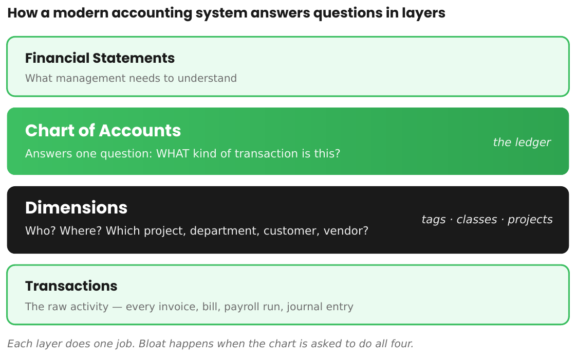
The chart of accounts answers one question: what kind of transaction is this? Revenue, payroll, insurance, travel, professional fees, interest. That's all. Everything else — who was paid, which customer, which project, which department, which location — belongs in the dimensions layer: the vendor record, the customer record, projects, classes, tags. Most accounting systems already provide these tools. Charts become monsters when a department ignores them and forces the general ledger to carry information the other layers were designed to hold.
Hold that picture while we build. The whole method is really just a disciplined way of keeping each question in its proper layer.
Step 1 — Decide whether it's actually time to redesign
A chart of accounts is foundational infrastructure, and you don't casually rebuild infrastructure in the middle of a reporting cycle. Disliking the account names is not a business reason. Before touching anything, confirm there's a real reason to redesign.
The strongest opportunities are natural inflection points:
- Software implementation or ERP migration. Never migrate clutter. Moving to a new platform is the cleanest moment to redesign rather than replicate.
- Fiscal year-end. Comparative reporting stays clean, budgets align to the new structure, and training starts with a fresh year.
- A controller or accounting-leadership transition. A new controller shouldn't silently inherit twenty years of someone else's decisions. Evaluating whether the chart still fits the business is part of taking the seat.
- A major change in the business — new operating segments, an acquisition or divestiture, a new management team, a significant shift in products or services.
And there are times to wait. Don't restructure two weeks before year-end, during an audit, or in the middle of another major initiative the department is already absorbing. The goal is a clean transition, not a heroic one.
Step 2 — Design the financial statements first
Most organizations build the chart first and hope the financial statements work themselves out. Reverse it.
Start with the reports management actually reviews every month. What revenue categories matter? What cost categories drive decisions? Which operating expenses deserve visibility? What needs to appear on the balance sheet? Those answers become the major categories of the chart, and everything else is built backward from them.
This is the single habit that most separates a designed chart from an accumulated one. Design the reporting, then design the chart to produce it — not the other way around.
Step 3 — Build the smallest chart that answers those questions
With the statements drafted, every proposed account faces one test:
Track what you measure.
Every account should answer a management question. If leadership reviews software spend every month, create a software account. If subcontractor costs are evaluated regularly, separate subcontractors. If product and service revenue drive different decisions, separate them. But if no one has ever asked how much was spent at one particular vendor, the account shouldn't exist simply because the transaction does. There's a quiet corollary worth saying out loud: if you never report on something separately, don't create an account for it.
The objective isn't the most detailed chart. It's the most useful one.
Step 4 — Separate the questions before adding an account
When someone proposes a new account, the first move isn't yes or no. It's to ask which question they're really trying to answer — and whether the chart is even the right layer for it.
Only what belongs in the chart. Who belongs in the vendor or customer record. Where, which project, which department belong in dimensions, classes, or tags. If a dimension can answer the question, the account is unnecessary. This single discipline prevents most of the bloat a chart accumulates over its life, because the majority of “we need a new account” requests are really “we need to see this cut a particular way” — and a report, not an account, is the right tool for that.
There's a number worth reacting to here. A controller should be able to justify having more than fifty accounts across the entire trial balance. The point isn't the figure — argue with it if you like — it's the principle underneath it: every account should have a purpose that cannot be achieved another way. Scale doesn't automatically demand more accounts. Tags, classes, filtered views, and custom reports usually answer the question that another account would only have made more expensive.
Step 5 — Choose a numbering convention that fits the business
One of the first questions controllers ask is whether the chart should use 100, 1,000, or 10,000 numbering — and whether to use decimals, dashes, or some invented scheme. There's no universally correct answer. There are only trade-offs, and the right frame is capacity planning, not dogma.
A small service business with fifty accounts doesn't need five-digit numbers and decimal extensions. A large, multi-entity organization shouldn't box itself into a range that leaves no room to grow. As a general guide: 100-series numbering works for very small, simple businesses; 1,000-series is an excellent default for most privately held companies; 10,000-series becomes practical for larger organizations with extensive reporting needs. Structured ranges let someone navigate the chart without reading every line:
1000 Assets
2000 Liabilities
3000 Equity
4000 Revenue
5000 Cost of Sales
6000 Operating Expenses
7000 Other Income & Expense
That's navigation, not decoration. Avoid decimals, dashes, and embedded meanings; complex numbering rarely makes a chart easier to understand and usually does the opposite. Designing a chart of accounts is not renovating your home — industry conventions exist for a reason. Use them unless there's a compelling reason not to.
Step 6 — Design the balance sheet with restraint
Here's a distinction that should change how the chart gets built: be more generous with income statement accounts than with balance sheet accounts. Not because one matters more, but because one is far more expensive to own.
An income statement account mostly supports reporting. A balance sheet account is a standing obligation. Every asset, liability, and equity account must be reconciled every period, needs someone who understands what belongs in it, often carries a supporting schedule, and usually requires an accounting policy to explain it.
Every balance sheet account is a promise to reconcile it forever.
That's the lens. An unnecessary expense account is mild clutter. An unnecessary balance sheet account is recurring work the department will carry for years. Income statement accounts deserve thoughtful design; balance sheet accounts deserve genuine restraint, and each one should justify its existence before it's created.
Step 7 — Build the income statement around decisions
Income statement accounts should mirror how management evaluates the business, not how transactions happen to arrive.
Revenue should be organized by type — product, service, subscription, maintenance, time-and-materials — whatever categories management actually reviews. Revenue should not be split by customer; that Customer A bought and Customer B didn't is a question for the customer record, not the chart. Cost of sales and operating expenses follow the same logic: answer the questions leadership asks most often, and drill down only when an accountant would otherwise spend more time filtering and searching than the separate account would cost to maintain.
This is also where vendor-named accounts get caught. “Adobe Expense,” “Microsoft Expense,” “Amazon Expense,” “FedEx Expense” aren't categories — they're vendors. The vendor record already says who was paid; the account is supposed to say what was purchased. Don't ask one field to answer two questions.
Step 8 — Establish governance
Most departments control cash carefully: payments need approval, journal entries are reviewed, vendor creation is restricted. Yet at many companies, anyone on the accounting team can create, rename, disable, or reactivate a general ledger account at will. The blueprint of the entire system is left editable by everyone.
The chart of accounts deserves the same governance as the transactions flowing through it. A workable rule: only the Controller or Accounting Manager may create, deactivate, merge, or renumber accounts, or change account types. Everyone else submits a request. It's a small control, and it's the difference between a chart that evolves through design and one that drifts through convenience.
Step 9 — Build it in Excel, then import
Before creating a single account inside the accounting system, build the entire chart in Excel. Seeing the whole structure on one page is what makes the problems visible — duplicate ideas, missing categories, numbering inconsistencies, and the accounts that a dimension could replace. Review it, challenge it, refine it. Only once the design is settled should it be imported.
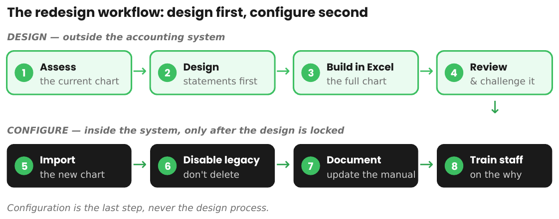
This is design-first, configure-second — the same discipline that governs any good system implementation. Clicking around inside the ERP trying ideas is how clutter gets built in the first place. Think first, build second, then import.
Step 10 — Retire the old chart deliberately
A redesign doesn't mean deleting hundreds of historical accounts overnight — historical data still depends on them. Instead, import the new structure, disable the obsolete accounts to prevent future posting, and preserve the history for reporting. Then let the legacy accounts retire gradually as their activity concludes. For a large organization, fully transitioning may take months or even a full fiscal year. That's perfectly acceptable; the objective is a clean transition, not a fast one.
Step 11 — Document the design
A redesigned chart isn't finished until the documentation reflects it. Otherwise the department has a new chart and a set of instructions describing the old one. Update the Accounting Operations Manual, the policy and month-end close documentation, the financial statement mapping, and the staff and new-hire training materials. Every member of the department should understand not only what changed, but why. A chart of accounts should never exist independently of the department that uses it.
The five principles
Strip the steps away and the method rests on five ideas:
- Design it. Don't inherit it. A chart should be the product of intention, not the residue of history.
- Track what you measure. Every account answers a management question; everything else belongs in a generalized account.
- Use dimensions before accounts. The chart answers what. Vendors, customers, projects, and tags answer everything else.
- Every balance sheet account is a promise to reconcile it forever. Restraint on the balance sheet is restraint on future work.
- Every account should earn its place. If it doesn't improve a decision, support a measurement, or satisfy a reporting requirement, it doesn't belong on the chart.
Underneath all five is a single idea that runs through modern controllership: an account costs five seconds to create and years to maintain. The work of accounting isn't the entry — it's the maintenance cost of the decision.
Before you create your next account
The next time someone asks to add a general ledger account, run it through three questions:
- Will management regularly measure this separately?
- Can a dimension, tag, class, or report answer it instead?
- Am I creating an account — or years of future maintenance?
If the account can't survive those questions, it doesn't belong in the chart.
Implementation checklist
Use this to rebuild a chart from start to finish:
☐ Confirmed a legitimate business reason and timing for the redesign
☐ Designed the target financial statements first
☐ Tested every proposed account against “track what you measure”
☐ Moved who / where / which-project questions to dimensions, not accounts
☐ Removed vendor-specific and customer-specific accounts
☐ Chose a numbering convention sized to the business — no decimals or dashes
☐ Applied extra restraint to balance sheet accounts
☐ Organized revenue by type and expenses by management question
☐ Established governance: who may create, merge, rename, or disable accounts
☐ Built the full chart in Excel and reviewed it before configuration
☐ Imported the new chart and disabled — not deleted — legacy accounts
☐ Updated the Accounting Operations Manual and trained the department
☐ Scheduled an annual review of the chart
